


8 Spring Color Schemes That Paint Pros Love for 2025
2025.03.03
Courtesy of HGTV Home by Sherwin-Williams
After the dark and dreary days of winter, it's only fitting that spring color palettes channel the season's positive energy and playful attitude. If there are paint projects you've been putting off for months, there's no better time than spring to tackle them. And if you could use a little bit of seasonal inspiration, you're in luck, because we asked paint color experts to share the spring color schemes that will be hot in 2025.
These picks include lovely pastel color combinations and sunny yellow hues, as well as pops of earthy brown layered with dark neutrals. Whether you're painting walls or kitchen cabinets, these color pairings are the ultimate way to give your space a spring refresh.
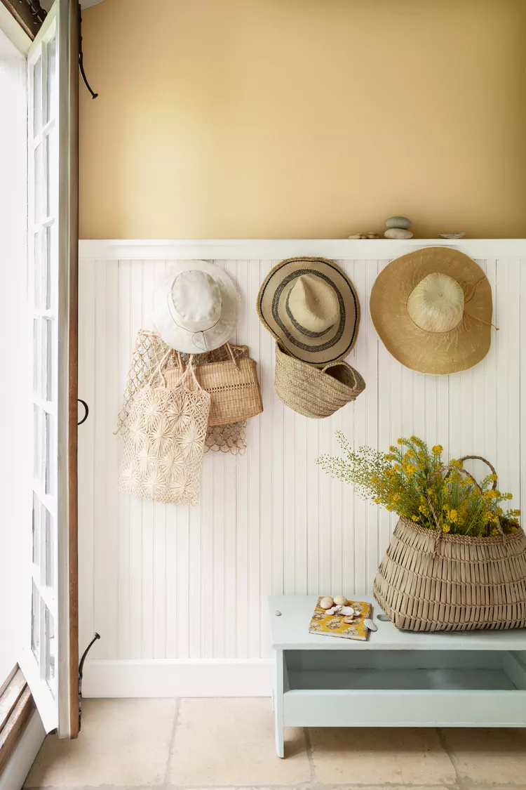
Courtesy of Benjamin Moore
Golden Yellow and Off-White
Channel spring sunshine with Benjamin Moore's Chestertown Buff, an earthy golden hue that injects inviting warmth into any space. "With its warm beige undertone, it creates a comforting neutral backdrop, while the soft yellow hue brings the sunlight indoors," says Hannah Yeo, senior manager of color marketing at Benjamin Moore. Pair this honey hue with a soft off-white paint color and take Yeo's advice and use the color pairing in a mudroom or entryway to infuse the space with the fresh, welcoming feel of spring.

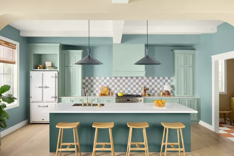
Courtesy of HGTV Home by Sherwin-Williams
Calming Blue and Green
You can't go wrong with a classic spring color pairing like blue and green. “We continue to see a love for calming hues from the blue and green color families, and green is the ultimate spring color as it represents nature and signifies growth," says Ashley Banbury, color marketing manager at HGTV Home by Sherwin-Williams. She suggests using a sage green shade like Quietude and pairing it with a rich green that has blue undertones, such as Rocky River. The color combination is both refreshing and peaceful, and a great pick for private spaces such as bedrooms as well as gathering areas like a kitchen.
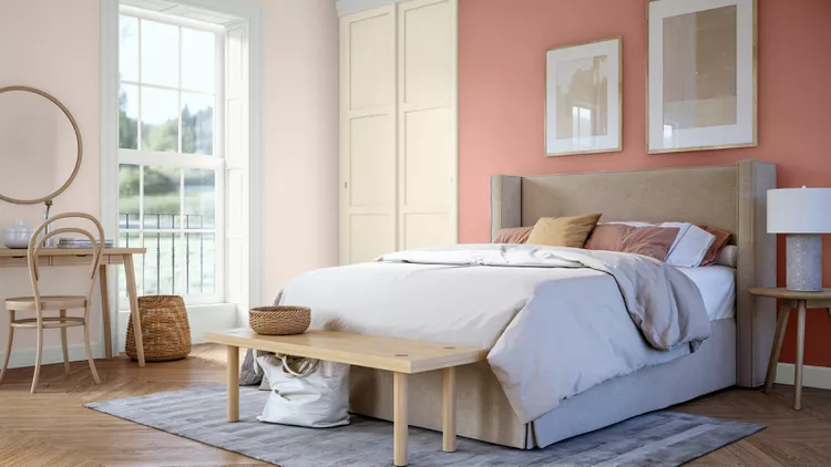
Courtesy of Benjamin Moore
Blush Pink and Soft Green
For a gentle touch of light and softness this spring, go with a blush pink hue such as Tissue Pink, which Yeo describes as "a quietly colorful hue which has a restorative quality, while still feeling fresh and uplifting." Yeo suggests pairing it with Paris Rain, a soft gray-green shade for a flower-inspired room that evokes tranquility. To complete the look, layer in buttery tones and soft neutrals for a calming, optimistic atmosphere.
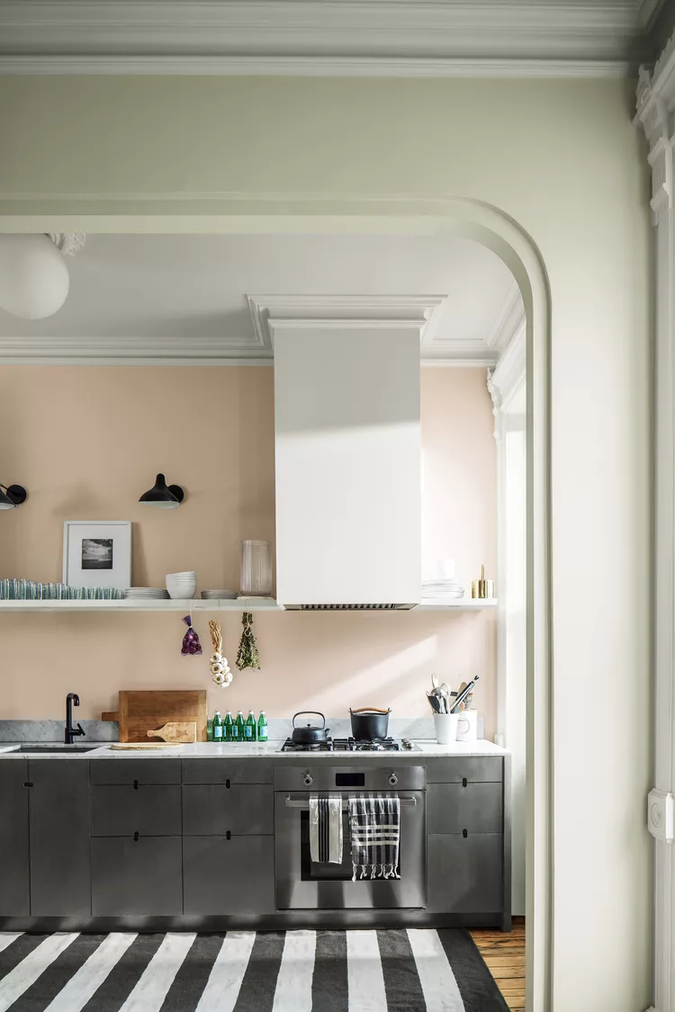
Courtesy of Glidden
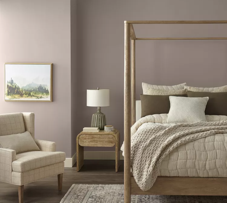
Soft Beige, Calming Blush, and Earthy Brown
"For spring 2025, expect to see a shift toward colors that evoke a sense of lightness, nature, and rejuvenation," says Ashley McCollum, Glidden color expert. To create a calm yet visually interesting bedroom color palette perfectly suited for spring, McCollum suggests pairing a blush shade like Sablewood with Long Weekend, Delicate White, and Adobe White. Complete the seasonal refresh with light natural woods, soft fabrics, and rattan accents.
Courtesy of Sherwin-Williams
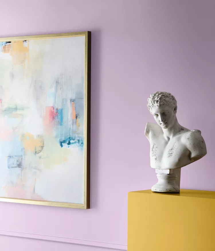
Pastel Lilac, Pink, and Gold
"I love the idea of pairing a pastel like lilac with a bolder color like bright pink or gold," says Emily Kantz, color marketing manager at Sherwin-Williams. She recommends starting with a soft hue like Euphoric Lilac and pairing it with a saturated pink like Dragon Fruit and sunny shade such as Quilt Gold. To balance out this colorful spring palette, Kantz recommends layering it with pops of bright white like the tried and true Alabaster.
Courtesy of HGTV Home by Sherwin-Williams
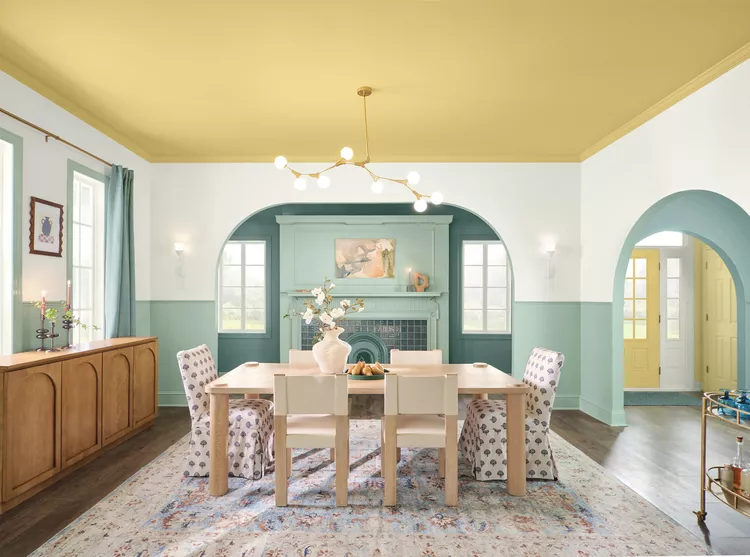
Pastel Yellow and Crisp White
"Spring is ripe with pastels and we’ll also see a continuation of the butter yellow trend from last year but with newfound sophistication and combined with fresh and airy neutrals," Banbury says. To capture the warmth and optimism that define the spring season, she suggests pairing Convivial Yellow and Snowbound. The golden yellow hue injects energy and brightness to entryways, kitchens, and social spaces, and layering it with the cool, crisp white hue makes for a fresh and airy color scheme perfect for spring. "This pairing reflects the longer days and joyful renewal of the season, making any space feel more inviting, cheerful, and effortlessly stylish,” Banbury says.
Courtesy of BEHR
Earthy Brown and Dark Neutrals
Reminiscent of spring garden soil, a nature-inspired color scheme of earthy browns and dark neutrals is an elegant and understated way to greet the season. Shades of brown have been making a comeback recently, replacing cool grays and creating warm and inviting spaces. "This spring, look for versatile, earthy tones like Wild Truffle and Gardener’s Soil to bring the outdoors inside," suggests Erika Woelfel, BEHR’s vice president of color and creative services.
Courtesy of Sherwin-Williams
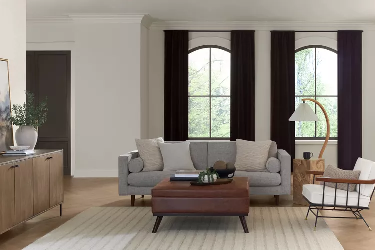
Creamy White and Earthy Neutral
Tap into the quiet luxury trend this spring and refresh your space with calming layers of creamy whites and earthy neutrals. "One big trend we’re expecting to keep momentum this year, is quiet luxury, which pairs exceptionally well with spring cleaning and the need to have a fresh and zen space," Kantz says. She suggests starting with a base creamy white like Creamy, which is an ideal foundational shade that homeowners can use to lay the groundwork for earthy neutral accents. For these, Kantz recommends Keystone Gray and Minimalist, and elegant darker shades like Sealskin andCarnelian.
The 53rd Jinhan Fair
Jinhan Fair Online Exhibition


 Visitor Registration
 Booth Application